
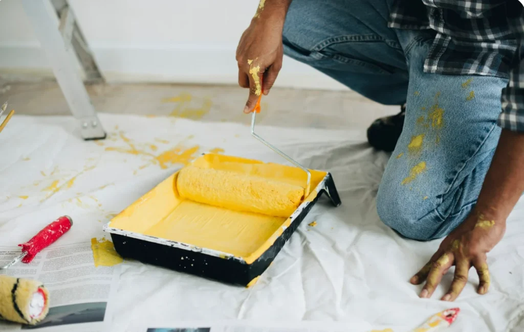
Selecting paint colors involves much more than matching furniture finishes or following popular design trends. Color psychology, the study of how hues dictate human emotions, spatial perception, and behavioral responses, plays a vital role in interior painting. The wall colors you choose directly influence how a room feels, affecting whether a space promotes focused productivity, peaceful rest, or energetic social interaction. Light absorption, color temperature, and saturation levels significantly alter perceived spatial boundaries and natural light distribution. Understanding how specific color families affect human psychology allows homeowners to curate intentional, harmonized living environments tailored to the precise function of every room.
Key Takeaways
- Emotional Conditioning: Warm tones encourage socialization and energy, whereas cool tones evoke tranquility and mental focus.
- Spatial Perception: Light, high-value colors expand small spaces by reflecting light, while deep, low-value shades pull walls inward for cozy intimacy.
- Functional Alignment: Matching room color choices to daily activities enhances productivity in home offices and restful recovery in bedrooms.
- Lighting Interaction: Natural sunlight, warm incandescent bulbs, and cool LED fixtures dramatically alter how paint pigments appear throughout the day.
- Sheen and Saturation: Matte finishes soften intense bold hues, while higher sheens reflect more light, intensifying color vibrancy.
The Fundamentals of Color Temperature and Spatial Dynamics
Paint colors fall along a spectrum between warm and cool temperatures, each creating distinct psychological and spatial effects.
Warm Colors (Reds, Oranges, Yellows, Warm Terracottas)
Warm hues stimulate the nervous system, boosting energy, appetite, and conversational flow. In interior spaces, warm colors are considered “advancing colors” because they visually draw walls closer, making large or chilly rooms feel cozy and inviting.
Cool Colors (Blues, Greens, Purples, Cool Grays)
Cool shades produce a calming biological effect, lowering heart rates and reducing visual strain. Cool colors act as “receding colors,” visually pushing walls outward to make compact rooms feel expansive and open. Research from the National Center for Biotechnology Information (NCBI) highlights that exposure to natural green and blue hues reduces stress levels and improves cognitive focus in built environments.
Room-by-Room Color Psychology Guide
To maximize emotional and practical benefits, align paint selections with the primary activities taking place in each living area.
- Living Rooms and Foyers: Warm neutrals, soft ochres, and inviting greiges promote warmth, comfort, and effortless social interaction.
- Bedrooms and Rest Zones: Deep slate blues, sage greens, and muted lavenders lower stimulation to support healthy circadian rhythms and deep rest.
- Home Offices and Study Areas: Muted forest greens and soft blues enhance concentration without causing cognitive fatigue or eye strain.
- Dining Rooms and Kitchens: Warm terracottas, warm creams, and subtle yellow undertones stimulate conversation and appetite.
- Bathrooms and Home Spas: Soft aquas, crisp whites, and pale seafoam tones evoke cleanliness, clarity, and refreshing spa-like renewal.
Light Refraction and Color Accuracy
A paint swatch rarely looks identical once applied across four walls. Environmental light sources drastically shift color perception.
| Light Source | Color Temperature | Psychological Impact | Best Paint Adjustments |
| North-Facing Natural Light | Cool, bluish tone | Reveals cool undertones, can make grays feel chilly | Choose warm-based undertones (yellow or pink base) |
| South-Facing Natural Light | Intense, warm yellow | Enhances warmth, can make bright colors look vivid | Cool tones and muted grays balance high glare |
| Warm Incandescent (2700K) | Cozy, amber glow | Accentuates reds, yellows, and warm wood grains | Flatter cool blues, making them appear slightly duller |
| Cool LED Lighting (4000K+) | Crisp, bright white | Highlights modern blues, greens, and crisp whites | Avoid overly bright stark whites to prevent glare |
According to interior lighting and paint specifications from the General Services Administration (GSA), testing paint samples under actual room lighting conditions is critical for verifying undertones before full application.
Balancing Undertones, Saturation, and Sheen
Mastering color psychology requires managing undertones, saturation levels, and paint finishes.
Managing Color Undertones
A neutral paint color is rarely pure white or beige. Most neutrals contain subtle undertones of green, pink, blue, or yellow. Conflicting undertones between wall paint, flooring, and cabinetry create visual tension. Ensure undertones align across adjacent architectural elements to maintain visual harmony.
Saturation and Finish Selection
Highly saturated primary colors can overwhelm a room when applied to all four walls. Using muted, desaturated variations (such as sage instead of bright green, or dusty navy instead of primary blue) provides psychological benefits while maintaining architectural sophistication. Additionally, flat or eggshell finishes absorb light for a soft, calming mood, whereas satin or semi-gloss finishes reflect light to energize high-traffic areas.
Achieving a flawless, psychologically balanced interior requires coordinating color palettes, surface preparation, and professional painting execution. For expert color consultation, surface repair, and complete residential interior painting, working with experienced general contractors ensures a refined finish. Revive 360 Renovation provides complete interior remodeling, dry-wall restoration, and custom painting services tailored to elevate your home’s aesthetic and comfort.
Frequently Asked Questions
What paint colors make a small room look larger?
Light, cool-toned paints like soft off-whites, pale sage, or ice blue reflect light and visually push walls outward. Painting trim, doors, and walls in identical light shades further eliminates stark borders, making compact spaces feel open and expansive.
Which colors are best for reducing stress in a bedroom?
Muted blues, soft greens, and warm slate grays are scientifically proven to promote relaxation. Avoid vibrant reds, intense oranges, or high-contrast patterns in sleeping areas, as these stimulate brain activity and interfere with restful sleep.
What is the 60-30-10 rule in interior color design?
The 60-30-10 rule is a classic decorating guideline. Use 60% of a room’s surface for the dominant base color (usually walls), 30% for a secondary color (trim, furniture, or cabinetry), and 10% for an accent color (artwork, pillows, or feature details).
How do dark paint colors affect mood?
Deep colors like moody charcoal, navy, or dark chocolate create a sophisticated, dramatic, and cozy environment. When applied thoughtfully with proper accent lighting, dark colors do not induce sadness; rather, they foster an inviting, high-end atmosphere.
Why does my gray paint look purple or blue on the wall?
Gray paints contain hidden undertones derived from their mixing pigments. Cool grays often feature blue, violet, or green bases that become prominent under cool natural light or specific LED bulbs. Always test paint swatches on your actual walls before committing.
Ready to revitalize your home’s interior with expert painting and design solutions? Contact Revive 360 Renovation today to schedule a professional color consultation and transform your living space.