
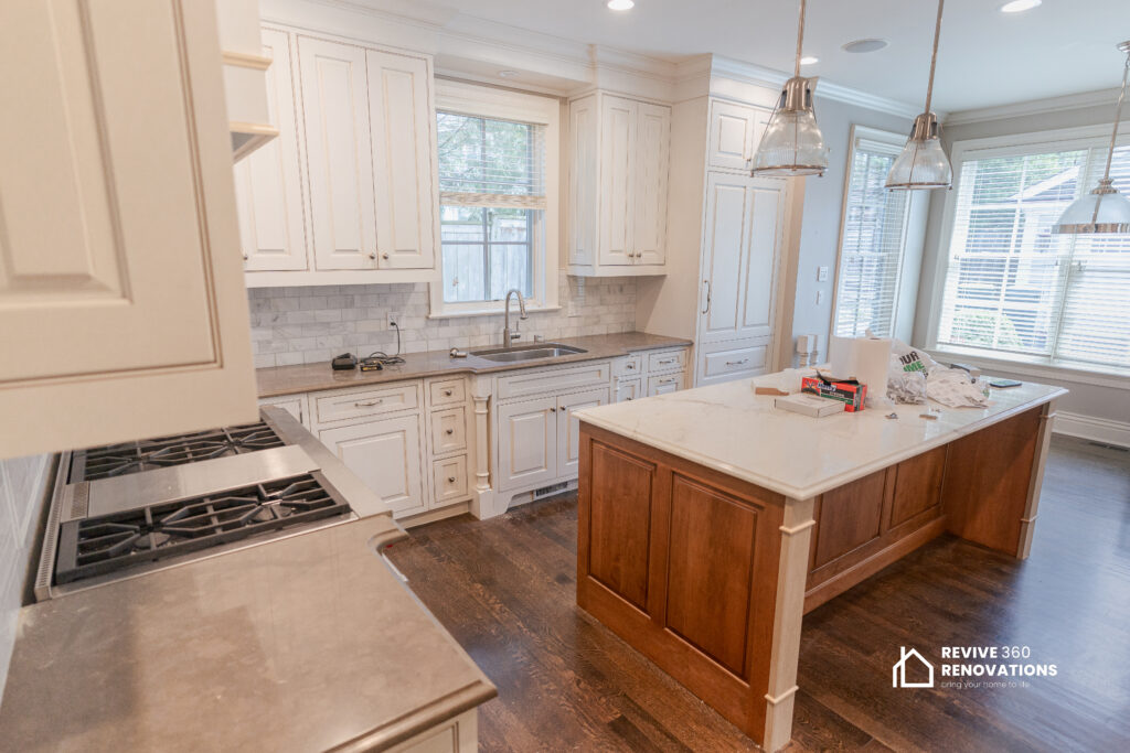
Cabinet color sets the tone for the entire kitchen, from the countertop you choose to how the room feels morning versus evening. It’s also one of the priciest design decisions to reverse, so getting it right matters. This year’s trends move well past the all-white kitchens of the last decade, opening the door to richer tones, mixed finishes, and cabinetry that behaves more like furniture than background. The kitchens that feel most current use color with intention—on an island, on lower cabinets, or as a warm wood tone—rather than applying one shade uniformly across every surface. Below, we cover this year’s biggest color and finish trends, how to pair them with materials already in your space, and the mistakes that make a trendy choice feel dated.
Key Takeaways
- Two-tone is now the default, not the exception: A deeper cabinet color on the lower run with a lighter tone up top adds visual weight and keeps sightlines open.
- Wood grain is back in a big way: Stained oak, walnut, and white oak cabinetry are replacing some all-painted schemes, especially on islands and shelving.
- Matte finishes are outperforming high-gloss for everyday kitchens: They hide fingerprints and water spots better while giving cabinetry a softer, custom look.
- A colored island can carry an entire kitchen: Keeping perimeter cabinets neutral while the island wears a bold hue adds personality without long-term risk.
- Undertones matter more than the color name: The same “greige” can read warm or cold depending on your countertop and flooring—where most DIY choices go wrong.
- Resale-minded homeowners should still leave room for personality: A neutral perimeter with a colorful accent appeals to both today’s homeowner and a future buyer.
Two-Tone Cabinetry: The Rule-Breaking Look Homeowners Love
Two-tone kitchens have moved from trend to standard practice this year. Instead of one color running floor to ceiling, homeowners choose a deeper, saturated color for the lower cabinets and drawers, then keep uppers lighter or swap them for open shelving. This grounds the room visually while keeping the upper half feeling airy—especially valuable in Chicago’s older homes, which often have lower ceilings or fewer windows than new construction.
The most successful two-tone pairings share one thread—contrast without clashing. Popular combinations include forest green lowers with warm white uppers, navy or charcoal lowers with soft oat or cream above, and deep espresso balanced against pale greige. The key to a two-tone kitchen that ages well is choosing colors from the same undertone family, warm or cool, so the transition feels deliberate. Many homeowners start by painting only the lower cabinets—a lower-cost way to test the trend before committing the whole room.
Stained and Natural Wood Tones Are Making a Comeback
After nearly fifteen years of painted-white dominance, natural wood is having a real moment again. This year’s wood-forward kitchens skip the honey-oak look of the 1990s for lighter, contemporary stains like white oak, ash, and rift-cut walnut, often finished with a low-sheen sealant that lets the grain show through instead of sitting under heavy lacquer.
The shift is partly practical: stained wood hides daily wear better than paint, since scuffs blend into the grain instead of standing out as chips. It’s also aesthetic—homeowners want kitchens to feel warmer after years of flat, monochrome surfaces. A common approach pairs a stained wood island with painted perimeter cabinets, adding warmth without committing the whole kitchen. For yellowed or dated wood cabinets, custom cabinets or professional refinishing can update the tone without tearing out otherwise sound boxes.
Matte vs. Gloss: Choosing the Right Finish for Your Style
Color gets most of the attention, but finish matters just as much to how a kitchen reads day to day. Matte and low-sheen finishes are the clear favorite this year, and not just aesthetically: matte diffuses light rather than reflecting it, softening a busy kitchen’s look and hiding fingerprints, water spots, and minor imperfections far better than a glossy surface.
Semi-gloss and high-gloss still have a place—in small kitchens where reflective surfaces bounce light around, or in formal spaces where a lacquered look fits the design intent. The trade-off is maintenance: gloss shows every smudge, and touch-ups blend less invisibly. For most families cooking daily, a matte or eggshell sheen offers the best balance of durability, easy cleaning, and a soft, high-end look. Ask your painter to test the exact sheen on a sample door in your kitchen’s lighting first.
Colored Kitchen Islands with Neutral Perimeters
If there’s one trend defining kitchens this year, it’s the colored island. Rather than repainting every cabinet, homeowners concentrate boldness in one high-impact piece. Deep blues, forest greens, terracotta, and even black are popular island colors, while perimeter cabinets stay a calm white, cream, or light wood.
This approach works on several levels: it creates a focal point in open-concept kitchens, it costs far less than painting the entire kitchen, and it makes updating the look later easy. A colored island paired with a neutral perimeter is one of the highest-return color choices in kitchen design, since it reads as intentional and custom without the commitment of an all-over bold color. It also pairs well with a contrasting countertop—soapstone or dark quartz makes it feel even more like a piece of furniture.
Pairing Cabinet Colors with Countertops, Hardware, and Flooring
Choosing a cabinet color in isolation is one of the fastest ways to end up with a disjointed kitchen. Color, material, and finish need to be considered together from the start.
Countertop Pairings
Warm cabinet tones—olive, terracotta, warm white—pair best with countertops that have warmth or movement, such as beige-toned quartzite or quartz with soft gold flecking. Cooler cabinet colors like navy, charcoal, or true white look sharpest against stark white quartz or honed black granite. Mismatching warm cabinets with a stark cool-white countertop is a common mistake, since the two undertones fight each other instead of complementing.
Hardware Finishes
Hardware finish should echo the kitchen’s overall temperature. Brushed brass and warm gold elevate darker colors like navy, forest green, and black. Matte black and brushed nickel read more neutral and work across almost any color, making them the safest choice for homeowners who may repaint later.
Flooring Harmony
Flooring is usually the largest fixed surface and hardest to change later, so it should anchor the palette rather than follow it. Light or mid-toned wood floors ground both painted and stained cabinetry, while darker floors can feel heavy unless balanced with a lighter countertop or backsplash.
Choosing a Color with Resale Value in Mind
Not every homeowner renovates with resale in mind, but those selling within a few years should give color extra thought. Highly saturated, trend-driven colors across every cabinet can narrow a buyer pool, even with excellent workmanship. The safer strategy is keeping most of the kitchen in a versatile neutral (soft white, warm greige, or light stained wood) and concentrating bolder color on a lower-cost, easier-to-repaint element like an island or pantry wall.
Kitchens that balance one bold, easily updated feature against a neutral foundation consistently appraise and show better than kitchens painted a single strong color throughout. For more on cost and technique, see our earlier piece on color trends for kitchen cabinet painting in Chicago.
Common Color Selection Mistakes to Avoid
Even homeowners with a strong sense of style run into the same pitfalls. The most frequent is testing swatches under a single light source—usually daytime sunlight—without checking how the color looks under evening or overhead lighting, when undertones shift dramatically. A color that looks crisp white at noon can read pale blue or yellow-green under warm LED bulbs at night.
The second mistake is choosing based on the paint chip’s name alone. Two “greige” shades from the same brand can lean noticeably warm or cool, and that difference shows once cabinets sit next to a countertop or floor. Always view a full-size sample against your actual countertop, backsplash, and flooring before finalizing a color—small swatches and showroom lighting are misleading. Sheen matters too: the same shade in matte and semi-gloss can look like two different colors.
Cost Considerations: Painting, Refacing, or New Cabinetry
Once you’ve settled on a direction, the next decision is how to get there—cost varies depending on your cabinets’ condition and how dramatic a change you want.
Cabinet Painting
For cabinets that are structurally sound but simply the wrong color, professional cabinet painting is typically the most budget-friendly path to a full color transformation—and the fastest way to test a two-tone or bold-island look.
Cabinet Refinishing
If you want to preserve or update a wood tone rather than paint over it, cabinet refinishing strips and re-stains the existing wood—ideal for chasing the natural-wood trend on cabinets that are already solid hardwood underneath.
Custom Cabinetry
When layout, storage, or condition is part of the problem—not just color—custom kitchen cabinets allow a completely new configuration built in the exact tone, wood species, and door style you want. It’s the highest investment of the three, but the only one that can change the kitchen’s footprint along with its color.
Whichever route fits your kitchen and budget, our full kitchen renovation services team can walk through your space and recommend the option that matches both your color goals and your timeline.
Frequently Asked Questions
What is the most popular kitchen cabinet color right now?
Warm, earthy neutrals like soft greige and warm white remain popular for most cabinetry, while deep greens, navy, and black lead as accent colors for islands. Two-tone combinations pairing a bolder color with a neutral are the most requested look.
Are white kitchen cabinets still in style?
Yes, but the white itself has shifted—stark, cool whites have given way to warmer, creamier whites that pair more naturally with wood tones and warm metal hardware.
Should upper and lower cabinets be different colors?
Not always, but it’s popular and effective this year. A darker or bolder color on lower cabinets with lighter uppers grounds the room and keeps the space from feeling visually heavy.
What cabinet color is best for a small kitchen?
Lighter colors and warm whites make a small kitchen feel larger since they reflect more light. To add color, concentrate it on a small element like a pantry door or narrow island rather than the full perimeter.
How do I know if a color will still look good in five years?
Choose a color with an undertone you’re confident about—warm or cool—rather than a highly specific trend shade, and pair it with neutral, timeless countertops and hardware. Reserving bold colors for easily repainted elements like an island also reduces long-term risk.
What sheen should I choose for painted cabinets?
Matte to eggshell sheens are the most popular choice this year since they hide fingerprints and minor imperfections while giving a clean, updated look. Semi-gloss remains solid for kitchens wanting more reflectivity or a traditional, lacquered appearance.
How long do painted cabinets last with normal use?
With professional-grade paint, proper prep, and a durable topcoat, painted cabinets typically hold up well for ten years or more, especially with gentle cleaning and prompt attention to chips near hardware.
Choosing the right cabinet color is easier with a design team that can hold real samples against your countertops, flooring, and lighting before anything gets painted or installed. If you’re ready to plan your kitchen’s color scheme, the team at Revive 360 Renovations would be glad to talk through your space, style, and the options that make sense for your home.